


Today, businesses must create digital products that are accessible and engaging no matter what device they’re viewed on. Building a website or app with strategies that improve user experience across multiple devices can be challenging. Adaptive, responsive, and mobile-first design all offer solutions to this problem.
In this article, we unravel the intricacies of Mobile-First web design, exploring how it diverges from Adaptive and Responsive design, and why this distinction matters in today’s digital landscape. Let’s discuss it more and consider the essentials.
The Evolution of Web Design: From Desktop-First to Mobile-First
Web design is an ever-changing field where adaptability is crucial. The debate between Mobile-First Design, Adaptive Design, and Responsive Design fuels creativity and innovation. Each approach has its unique style, catering to the diverse needs of the digital world.
Let’s discover all the terms one-by-one.
Mobile-First Design prioritizes mobile devices in the design process, ensuring that essential content is displayed correctly on smaller screens, while progressively enhancing it for larger displays. It emphasizes simplicity and focuses on creating a sublime mobile experience that resonates with the on-the-go user.
Adaptive Design, on the other hand, takes a device-specific approach, creating custom versions of a website for different device categories. This approach focuses on personalization and optimization but requires meticulous attention to detail and resource allocation.
Responsive Design, in its turn, adapts to various screen sizes using fluid grids and flexible elements. It ensures that the website remains visually appealing and functional across all devices, but requires a careful balance between aesthetics and performance.
The differences between these approaches lie in their approach to user experience, their ability to adapt to changing technology, and the level of control they provide to designers. Understanding the distinctiveness of each methodology enables designers to select the proper instrument for the task and create outstanding digital experiences that engage audiences on all devices.
Mobile-First Design: The Secret to Staying Ahead of the Competition
Technology is always changing, and a design that focuses on mobile devices is important for businesses that want to stay competitive. The widespread use of portable gadgets has changed how customers engage with brands, so it’s necessary for companies to adjust or they may be left behind.
Mobile-first design focuses on prioritizing the user experience on smaller screens, allowing businesses to optimize their websites and applications for devices that are essential in our daily lives. This approach goes beyond serving mobile users, but aims to deliver a seamless and user-friendly experience that surpasses the limitations of screen size.
Mobile-first design provides strategic advantages for businesses by expanding their reach, improving search engine visibility, and gaining a competitive edge in a mobile-driven landscape. It serves as a guide that leads businesses towards digital success in today’s fast-paced world.
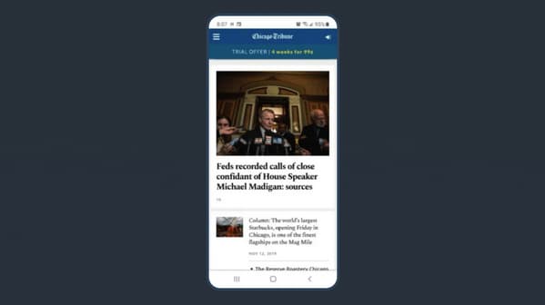
Chicago Tribune as an example of the mobile-first design
The question is how to build such a design and ensure it is intuitive and user-friendly. You can find a skilled outsourcing web development vendor to collaborate with. They will offer you specialists to solve your problems cost-effectively (by the way, the outsourcing app designer cost is lower than for services of the specialists in your area) and accurately.
Content Strategy: How to Find Your Brand’s Voice Working With Mobile First Design
Mobile-first web design prioritizes user experience on small screens. To achieve this, it is essential to keep content concise and focused. The text and visuals should be clear and easy to read. The content should be tailored for mobile devices and how users interact.
Technical considerations such as the page loading speed should also be considered. It is important to optimize images for mobile devices to ensure fast loading times without compromising quality. Testing across multiple devices is essential to achieve the best results.
Breaking the Rules: Unconventional Tips for Mobile-First Design that Actually Work
The skill of creating a successful mobile-first design is complex. The following standout advice will guide you through this fascinating journey.
Content hierarchizing for priority. Select wisely what is most important for consumers on smaller displays. Start with a simple design and add step-by-step more information as screen space permits. This makes sure that your main point is prominently shown.
A faster loading process. For quicker loading times, optimize your assets, including your photographs and videos. Take into account lazy loading methods and content prioritisation.
Flexible typography. When it comes to readability on mobile devices, typography is crucial. To make information easy to read, use readable typefaces, adapt font sizes for different screen sizes, and keep proper line spacing.
Gradual improvement. Build on a solid foundation that is perfect for mobile devices first, and then gradually improve the experience for bigger displays. This strategy guarantees a consistent user experience independent of the platform.
Touch gestures as a priority. Understand the importance of touch actions, including pinching, tapping, and swiping. Make sure to seamlessly include these activities into your design for smooth navigation and engagement.
Thumb-friendly navigation. Understand that mobile users engage with their thumbs the most. Create buttons, interactive elements, and navigational elements with thumb-friendly sizes and placements. This improves usability and lowers the possibility of annoying inadvertent clicks.
User testing. Conduct extensive user testing on real mobile devices specifically for your project. To make sure your design satisfies users’ demands, get their input and make changes based on actual user experiences.
Performance metrics. Continually track mobile-specific performance indicators, including Core Web Vitals and mobile page speed. Maintaining optimum performance requires regular evaluation and design improvement.
By incorporating these standout ideas into your mobile-first design approach, you’ll not only stand out from the competition but also make sure that your online presence is well-suited to the constantly changing needs of mobile consumers. In the end, your approach’s distinctiveness may help you stand out in a market.
Conclusion
Mobile-first design prioritizes designing interfaces for smaller screens first and then scaling up to larger screens. By doing so, designers can avoid usability issues that arise from scaling down desktop designs. Additionally, optimizing for mobile devices ensures faster load times when users access the website via their devices. With its focus on usability, scalability, and speed, mobile-first design continues to be important as more people use their gadgets to access websites.
We’ve enlightened only the mobile-first web design’s basics. If you would like to know more, you can apply to a skilled web development vendor. The vendor’s UI/UX designers will help you think out every detail of your future app design, and make it user-friendly and easy to navigate.