Design is a complex component of any software project. It’s believed that the design stage is one-third of the total development time. This fact proves the importance of this stage. That’s why designers rely on wireframes, mockups, and design prototypes in their workflow.
However, at first glance, these concepts are the same thing. So, how do we distinguish them? This article will answer all your questions on this topic.
The Concept of Wireframe
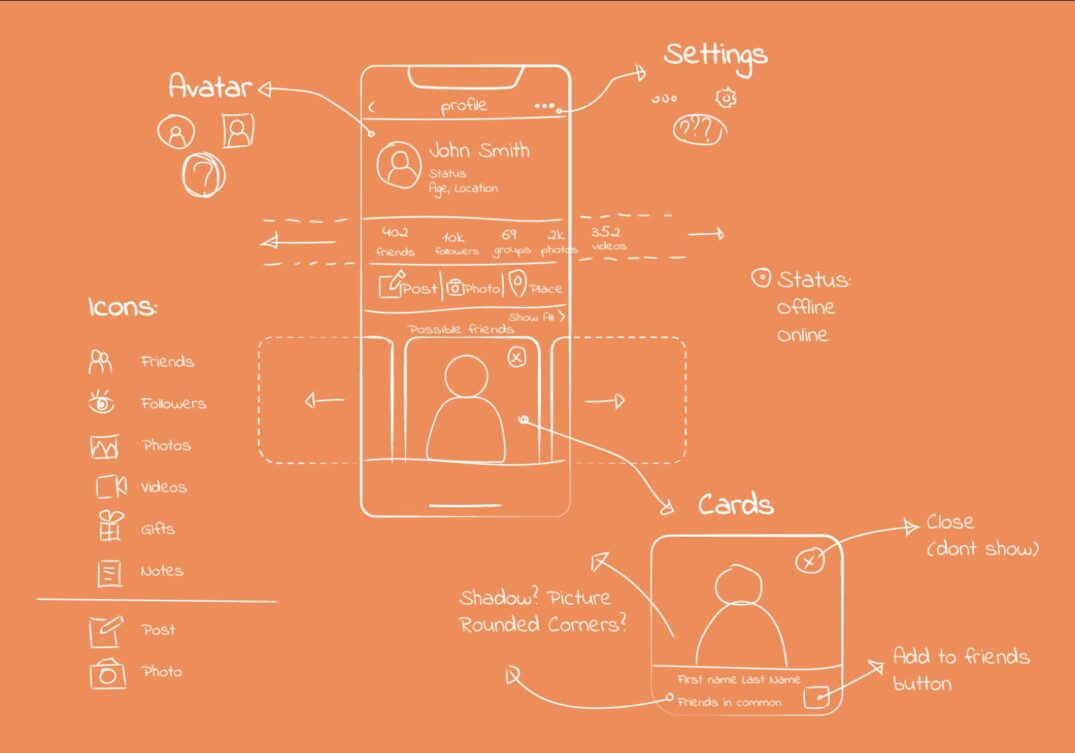
A wireframe is basically a draft of the future product. Wireframes display the future layout of the app’s components. Designers take care of wireframes at the initial stage of the design process. Although they may differ in the number of details, the main idea is to find the best spots for buttons, icons, and other components.
How to Build a Wireframe?
Unfortunately, there’s no one-size-fits-all answer to this question. The wireframe should be developed according to project specifications and customer needs. Besides, your layout should be user-friendly. If you’re building a wireframe for your own purposes, it doesn’t have to be very detailed. The key is that the wireframe should be clear and detailed enough for you. However, if you’re creating a wireframe for a team of designers or introducing it to a customer, then the number of details and peculiarities plays a vital role.
Some points have to be considered before the wireframing process:
- Primary UI elements of your project
- Additional UI elements
- The arrangement of each element
- The content that will be displayed on the page
The Purpose of Wireframe
Wireframes are needed to visualize and organize the content displayed on the user’s screen. That’s why wireframes are important. Mind, if you’re working on a simple, short-term project, the wireframing stage can be skipped. However, if that’s not your case, treat the wireframing with care. In turn, you’ll get more clarity on your project. Also, you’ll insure yourself against the possible expenses of rebuilding the whole design.
The Concept of Mockup
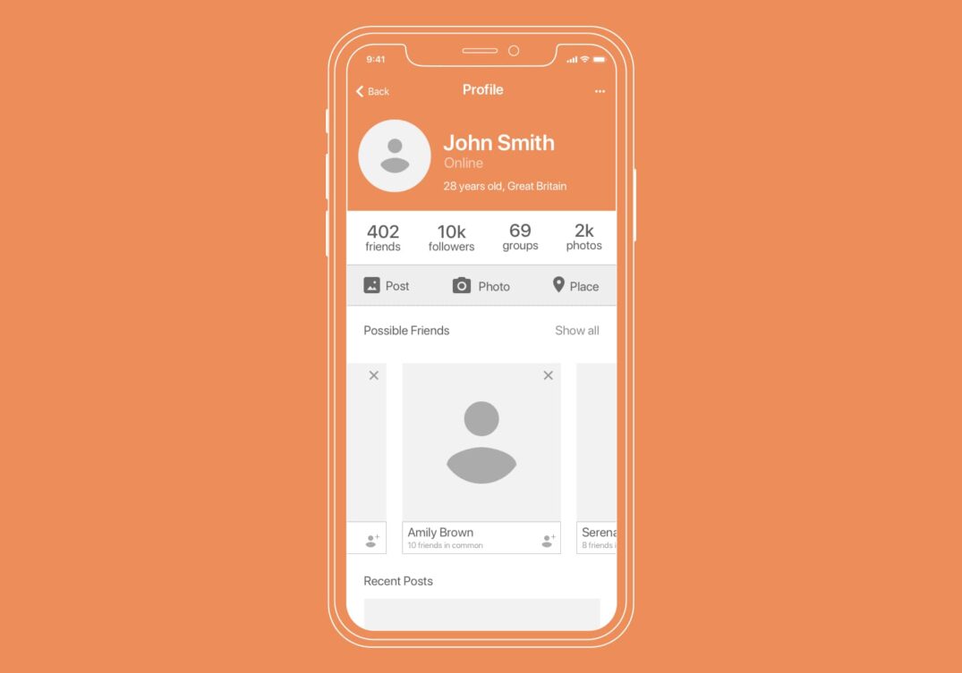
Designers use mockups to see a detailed picture of the future product. Unlike wireframes that allow you to skip small details, mockups require you to pay a lot of attention to them. Consider a mockup, not only a sketch but a final representation of your product. At this stage, designers work on the button names, icon shapes, font types, intervals between elements, and other small details. They also decide on images displayed on the website or in the application. Teams and clients can make use of mockups. The software development team gets comprehensive instruction on the project, while clients get a finished example of their product.
How to Build a Mockup?
During wireframing, you can decide on the details depending on the aim of your wireframe. However, mockups are an entirely different matter. Based on the previously built sketch, you have to paint the whole picture that will be presented to your clients and team members. So, before the mockup, you have to come up with a quality wireframe. Then, build all the missing components, and your mockup is ready for presentation.
Here’s the list of the most critical components that have to be thought out in the mockup:
- Color scheme and the overall color tone
- Navigation system
- Input forms, style of various signs, buttons, and other parts of the app
- Other details that influence the app style
The Purpose of Mockup
Even though a mockup is the final example of your product, it’s not the final stage of the design process. The mockup is only a picture of the project without moving parts. So, the mockup is your chance to make static objects perfect while you don’t have a load of features and animations above the design. This stage gives you more confidence and understanding of the final version of your project.
The Concept of Prototype
The prototype is a final version of the product that contains features and other interactive elements that the end-user will find while using your app. The prototype may have some differences from the released version of the product, but they should be insufficient. That’s not a draft created during wireframing but the tested copy of your product that will be delivered to customers.
How to Build a Prototype?
There are two different steps to prototyping. The first case implies rapid prototyping. When you rely on a pen-and-paper approach (elements placement on the paper) or create an interactive HTML model. This approach is widely used among startups since it’s the perfect way to receive a product model fast; there are also no tools required.
The second one relates to the traditional method. The prototype is made after the wireframing and mockup are ready. The final choice between fast prototyping and a complex design process will depend on your project requirements, timeframes, and budget.
Prototyping is the final leg of the design process. Its core intention is to define how users will work with your product. Hence, it’s critical to streamline the user experience and boost overall performance at this stage.
The Purpose of Prototype
The primary prototype’s goal is to nail down what your software is supposed to do, how it looks, and what features it includes. The prototypes necessity can be roughly split as follows:
- Prototyping allows for cutting down the time and resources. In case of bugs and vulnerabilities are revealed, they can be addressed before the product is released.
- It is used for testing needs. QA experts require a prototype to perform comprehensive software analysis: from functional to security. Thus, you’ll be able to deliver a better user experience.
- The prototype is required to pitch your idea to investors, thus increasing the chances of getting startup financing.
The Top 3 Tools to Build an Outstanding App Design
Today, UI/UX specialists don’t apply sketchbooks to get their jobs done. Instead, they make use of multiple tools to design blueprints and forms of the final digital products. I have singled out the leading ones and highlighted their benefits and weaknesses. Let’s consider each of them in detail.
Sketch
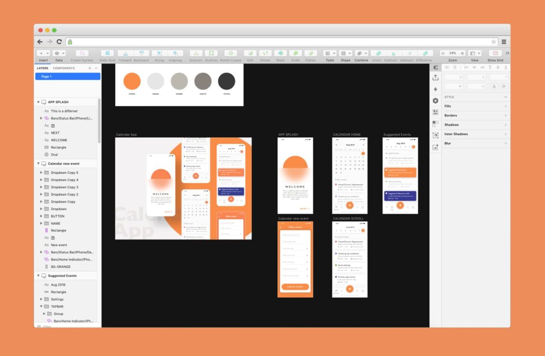
Sketch is one of the most popular designing tools developed specifically for macOS. It’s distributed on a paid basis with an initial payment of $99. After a year, the subscription should be continued, but for $79/year. Sketch offers a feature for editing layouts called Smart Layout. It allows designers to automatically adjust the size of the container when changing the size of its content and provides a number of other useful functionalities.
Sketch is a bit weak in terms of cooperation abilities compared to its alternatives. Still, it has some great prototyping features, like hotspots, maintaining position when scrolling, and a broad library of plugins. So, Sketch is a great choice if you’re using macOS.
Figma
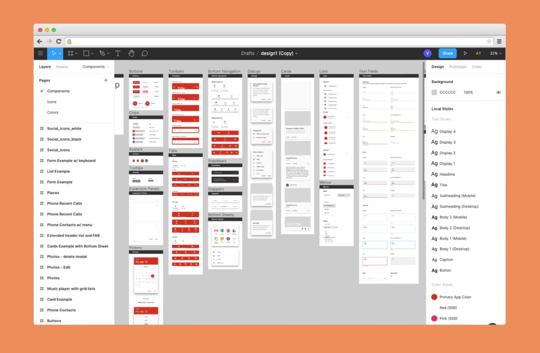
Figma is a relatively new software among its rivals, but it has already gathered a large audience of users. In terms of designing features, it reminds of Sketch, but it has some substantial advantages. The most adorable of them is collaboration. Previously, designers had to work on the same project in two different files. It was often the case when they realized that they’d worked on the same feature for several hours. Figma solved this problem by allowing designers to work on the same file. It works like real-time editing of Google Document by several persons.
Moreover, it has a handy version control history, so designers can return to previous file versions and track the changes in their projects. Figma is also good for prototyping because it doesn’t require you to upload the project to Invision or Marvel. It can create interactive prototypes and demonstrate animated interactions. It’s available for both macOS and Windows.
Adobe XD
Adobe XD is equipped with a number of features for designing, prototyping, collaborating, and more. Adobe offers a free plan for XD but with some limitations. A full version costs $9,99/month and is available both on Windows and macOS. It has a collaborative feature similar to Figma’s, but right now, it’s only at the beta-testing stage; that’s why Figma is a winner here.
Adobe dominates in the field of prototyping due to a wide variety of supported input devices. XD supports keyboards, gamepads, and even voice control triggers. Besides, Adobe also launched an ecosystem of plugins for XD in 2018. Even though Sketch has a broader range of plugins, XD catches up with its rival.
Wrapping Up
Now, you have a better understanding of the difference between wireframes, mockups, and prototypes. A well-performed design stages lead to lower expenses and increased product quality. That’s why you have to find a team of professionals that will make an attractive design for your app.


