


Design trends that kill conversions: how to order website design and reduce visitor traffic to zero.
Before ordering a website design, we are faced with a choice among a lot of very trendy, cool and necessary design tricks. Take for example the QR codes. Despite the good concept, they fail in their implementation. Just think: in order to read a QR-code a person has to download an additional application first (and only a completely strange person will install such an application beforehand). That is a person, a potential client has to make an additional and absolutely unnecessary for him action. That’s why we summarize: QR codes are senseless.
Theoretically safe solutions like flat design, non-standard navigation and carousel sliders are not any better. Yes, they are fun to experiment with, but when you start web site design, in the wrong hands, they will do more harm than good.In this case, these are perfect examples of how herd mentality can reduce conversions to zero. Let’s talk about why this happens and what to do to avoid it.
Let’s recap the main parameters that we influence with web design
- User experience: creating a user-friendly and intuitive interface that is easy to navigate.
- Visual design: creating a colorful and attractive appearance that captures the attention of visitors.
- Adaptability: website design should be adaptable to different screen resolutions and devices.
- Load Optimization: creating a site with a minimum amount of resources so that it loads quickly.
- Accessibility: creating a site that is accessible to all users
Flat design strikes back
Parallax in web design is like Andre Nozick in fashion. That is, if you don’t go overboard with its use, things will look as aesthetically pleasing, accessible and comfortable as possible. And the site will gain graceful depth and layering. But who can use it reasonably?
While parallax can hurt here and there, it can’t definitively kill a site. There are worse things to worry about.
Take, for example, a massive trend of the past few years – a flat design. His goal is beautiful: the maximum ease for the user. And the concept works, to a certain extent… So that a person could intuitively, without thinking to find the necessary information (which is perfectly realized in the design of the best user interfaces), the location of this information should be obvious. All seemingly simple.
But sometimes flat design is so simplistic that it becomes problematic. For example, when no form fields are labeled for data entry, or when shadows, colors and borders are completely removed. As a result, users simply can’t see the key elements of the site, which, in fact, were specifically created to bring you revenue.
Site design should not only be as aesthetically pleasing as possible, it should tell the user what to do next and where to do it. Flat design itself is good, the only problem may be how you implement it.
For convenience, we will give you an example of the application of flat design, which has not lost its primary function of simplicity, and in modern interactive methods tells the visitor what and how he should do.
Another reason for the decline in conversions is the design of simple text links.
After all, a link is an element that (a) is a navigation tool and (b) precedes a conversion. That is, obviously, the link must attract attention and match the user’s perennial association with the link. Simply put, it should be blue. And preferably with an underline. Yes, it sounds trivial, but that’s the way things are. And these examples are just flowers. The berries will be ahead!
The architecture of the site – not the main thing
Information architecture is a fancy term that allows consultants to charge more money because they look smarter, it explains how a website organizes information. That is, it is a logical organization of information in categories and blocks; the relationship of information blocks; prescribed path by which the user, moving from one block to another, will get to his destination.
In theory, the various menus and page navigation should help in this. But in practice, in the presence of multi-level or fuzzy navigation, it leads to the fact that people in droves leave the site before reaching the necessary information. This is confirmed by 100,000 usability studies conducted by UserTesting.com.
If you want to order a website design, check out Amazon. It serves as an exemplary example of proper navigation because it offers large pop-up sections to avoid complicated multi-level navigation. You can see options for all possible actions at once, and you don’t have to go back to your starting point a hundred times to find the information you need.
It is necessary to observe a clear, understandable hierarchy of the site, so that the user intuitively and immediately understand what is primary and what is secondary. This can help navigational icons, especially if we are talking about non-standard terminology or too complicated names of categories.
Of course, this will only delay the full exodus of visitors from your site. If you look at the situation more broadly, in this case, you’re a company that doesn’t understand its customers at all. Therefore, you need to change your approach.
If you doubt something – do it in a standard way. Or better yet, use trigger words to make sure you are understood.
Regardless of whether you want to order the site design, try to keep the flat hierarchy of the site, so that the visitor in just a few clicks can make all the necessary actions. Information should not be buried under layers of redundant categories and blocks, everything should lie on the surface.
In addition to high conversions, this approach will always help SEO: a better site organization means more visitors will come to the site, more visitors will perform the necessary actions, and, as a result, the conversion grows. It’s like a synergy. And here we get to our favorite callus. Something that makes the blood run cold.
There he is, the elephant in the room: the long merry-go-rounds.
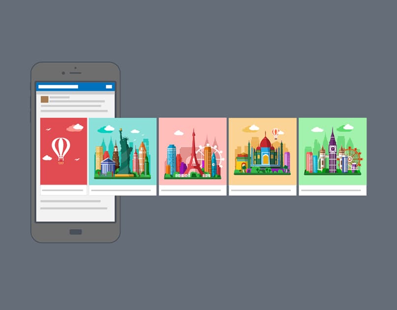
Carousels: herd mentality in action.
B2B companies love them. A simple analysis conducted by Search Engine Land showed that carousels are already on the homepage of 18 out of 30 companies’ sites (from various spheres of activity). And that’s despite the fact that they’re killing usability, conversions and speed.
Why are they so bad? Let’s explain.
Information for beginners: people don’t use them. Take the results of the same Search Engine Land study:
That is, in any case, the click-through rate for carousel is less than 1%. And this is often due to the fact that people perceive carousel as banner ads and completely ignore it.
And not only that no one clicks on the carousel, it has a lot of other disadvantages. It usually displays incorrectly on mobile devices. It’s bad for SEO because it has no static content, it doesn’t use titles correctly, it overloads and slows down the site with high resolution images, and it carries very little information using outdated technology.
So why use it at all?
For reasons of compromise, which in this situation dooms you to a life without conversions. As with flat design, carousels aren’t bad in and of themselves. What can be bad is its purpose. More often than not, a carousel is a reflection of the multiple selves of its initiators. It is like a herd of hippos, where each tries to outshout the other. As a result, merry-go-rounds appear out of place. When you want to please everyone, everyone loses. Designers lose because their ideal vision of the site does not coincide with the result.
Customers lose because what they wanted to order is a website design that matches their goals, but no one will hear them anyway. Their selfishness makes the site uncomfortable for visitors, and this consequently reduces conversions and reduces revenue.
Conclusion
In offline and print, design is static and passive. It is an object of art. But online works differently. It is interactive in nature, with form and function at its core. It is utilitarian.
Any trend in web design, be it parallax, flat design or navigation structure, can revitalize (or kill) your site. And there are elements that not only “blur” your message, but also work against it (like the carousel).
And here we have two pieces of news for you: the good and the bad.
The bad news is that design never stops. And the good news is that design never stops. You just can’t fail if you spot problems in time and fix them right away.